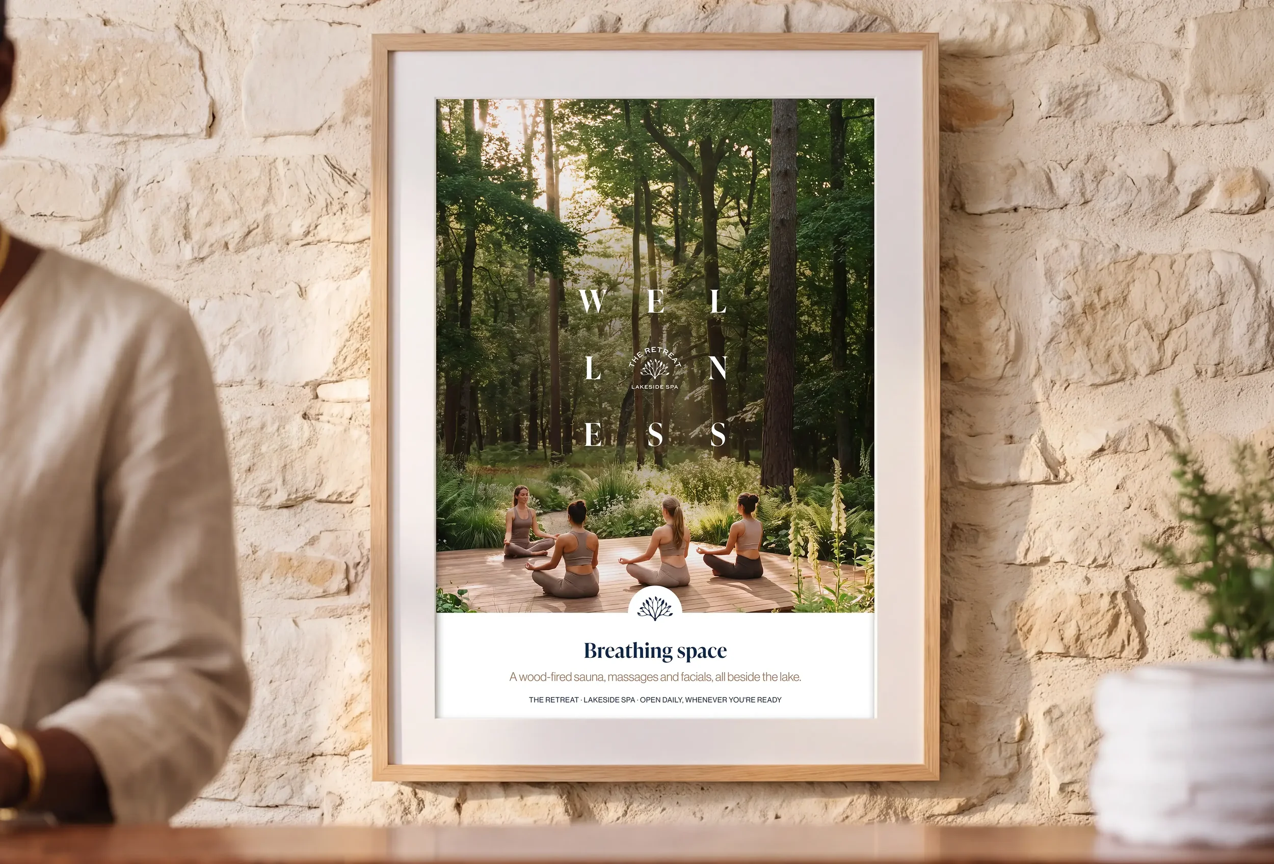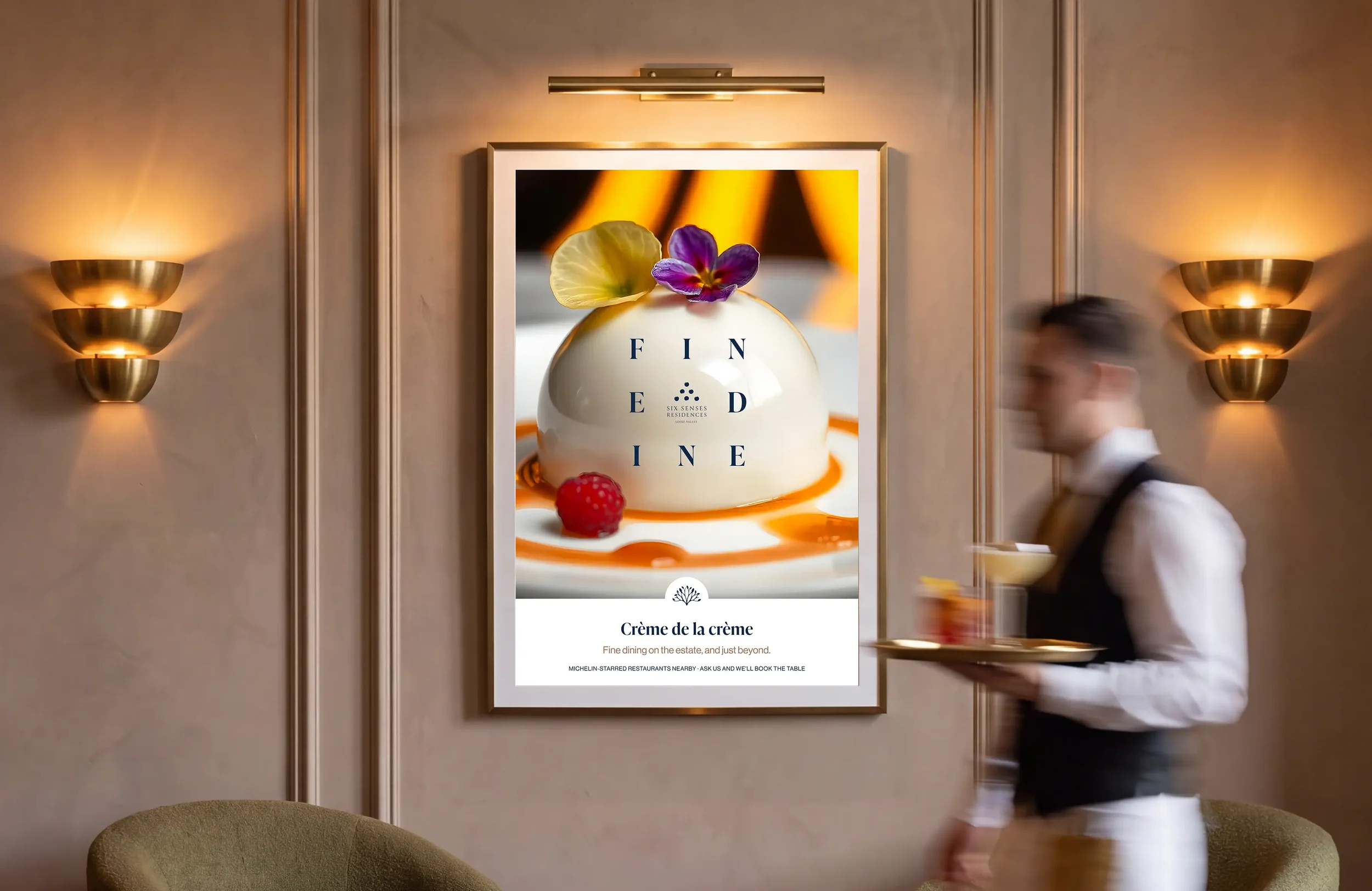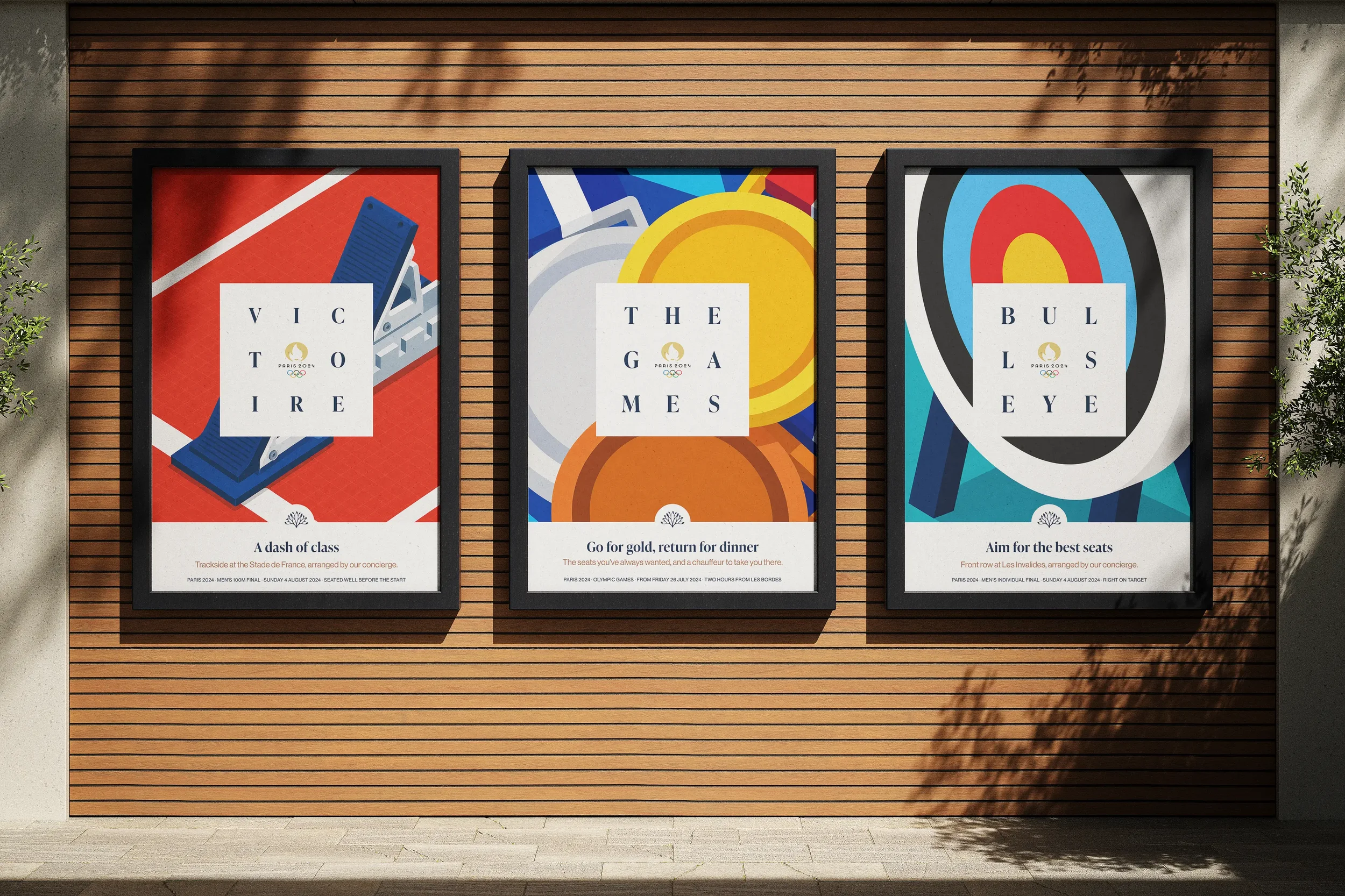
Fully serviced luxury residences immersed in wellness
DATE
2024-2025
Client
Les Bordes Estate
Les Bordes is a 1,400-acre private estate in the Loire Valley, tucked into the Sologne forest a couple of hours from Paris. It’s an exceptional place, but it wears that lightly. There’s no need to make much noise when the surroundings do so much of the talking.
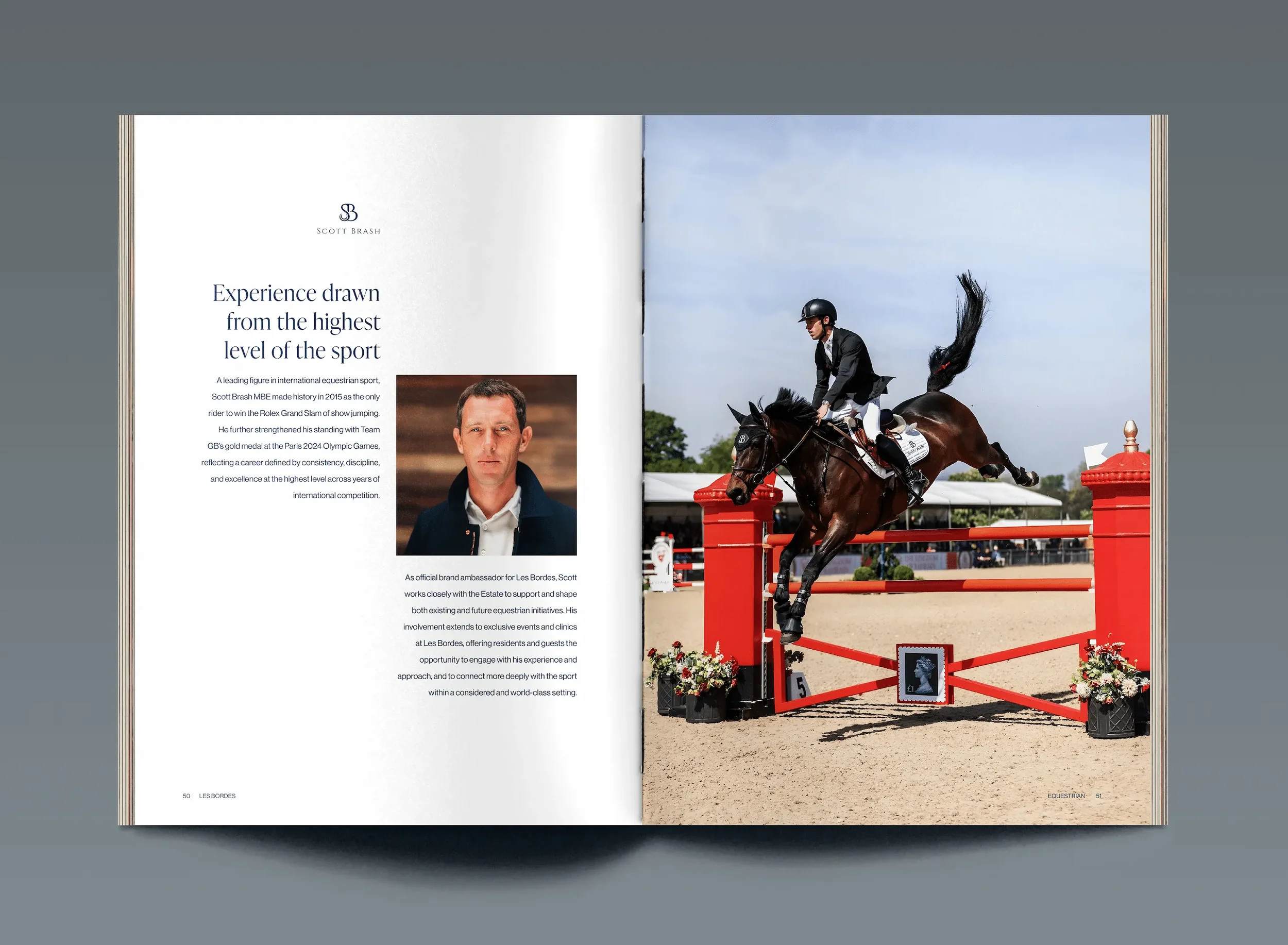
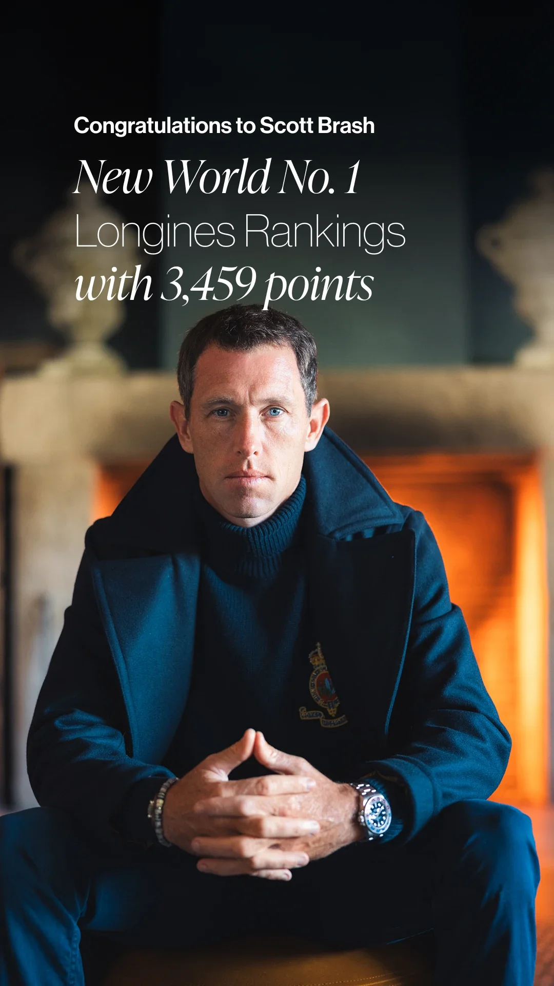
Golf has long been a big part of its reputation, with the Old Course by Robert von Hagge and the New Course by Gil Hanse drawing players from around the world. But the plans for Les Bordes were reaching well beyond the fairways. An equestrian centre with Olympic gold medallist Scott Brash, a Six Senses resort and branded residences were joining a setting already made for swimming, riding, cycling or simply taking your time.
A little pruning
World’s Finest, the estate’s official sales and marketing partner, brought me in as a freelance designer as those plans were gathering pace. Working closely with the Chief Brand Officer, I helped shape the refresh, trading ideas and testing how the brand could develop without losing what made it recognisable.
There was plenty worth keeping. But several versions of the logo were still doing the rounds, and older typographic styles kept turning up alongside newer ones, particularly in print materials produced in-house. Each piece might work on its own, but put them together and they didn’t quite feel like the same place. The language also needed to reflect the wider experience Les Bordes was becoming.
It called for some careful pruning. Enough to give the identity a clearer shape while keeping its roots intact.
Getting everything into shape
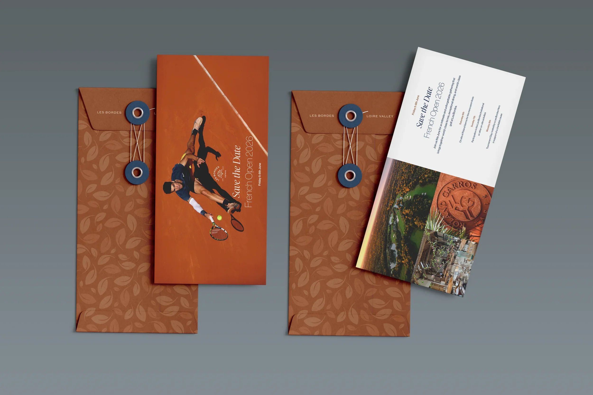
We started with a modern grid to bring consistency across print, signage and merchandise. It gave us a dependable structure to work with and enough freedom to keep things interesting.
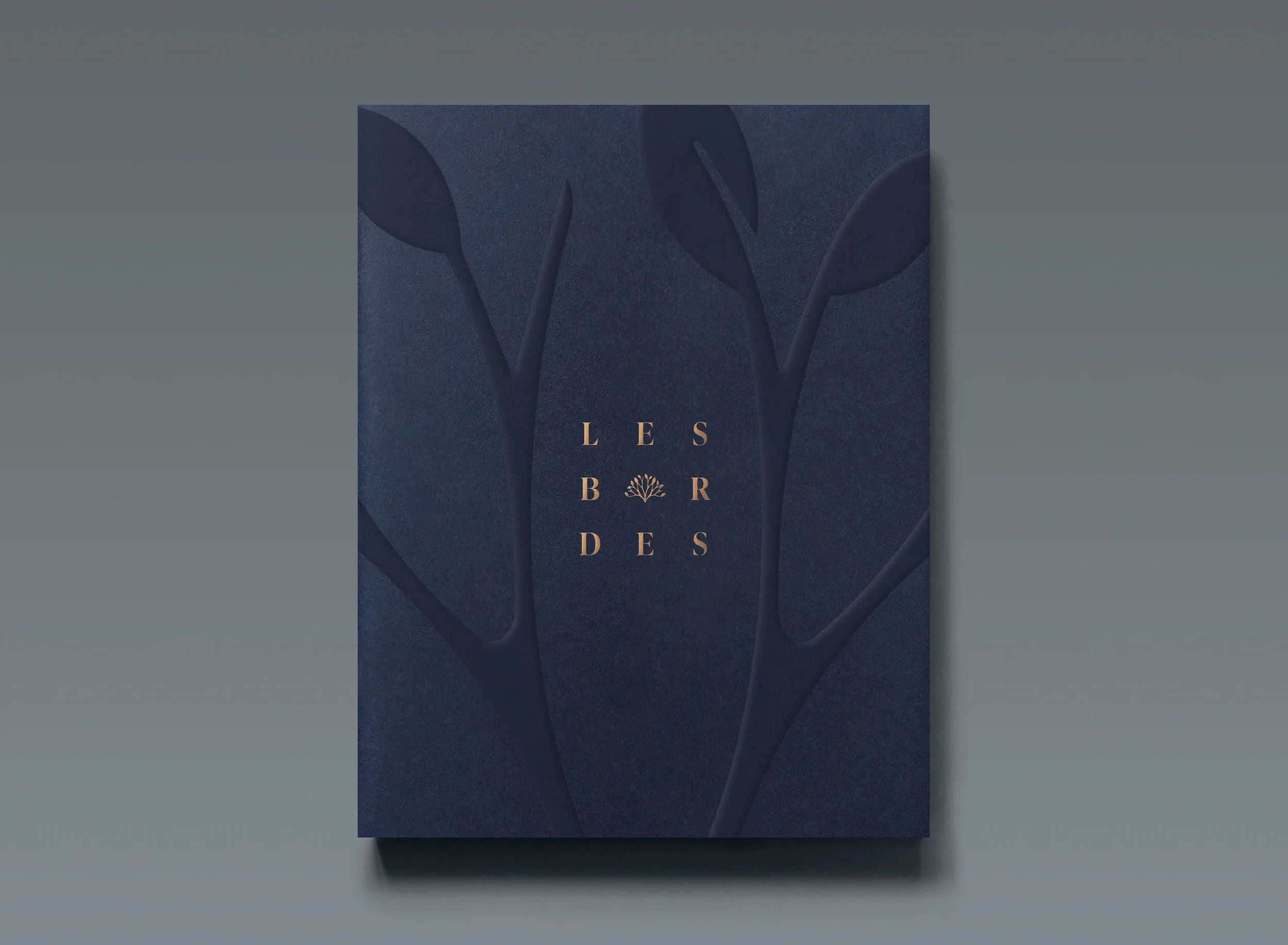
The logo deserved the same attention. Its leaf symbol was a good idea, but some of the drawing felt awkward. We rounded the leaves, softened the line work and refined the curves. Small adjustments, but together they made the mark feel more assured and better suited to its surroundings.
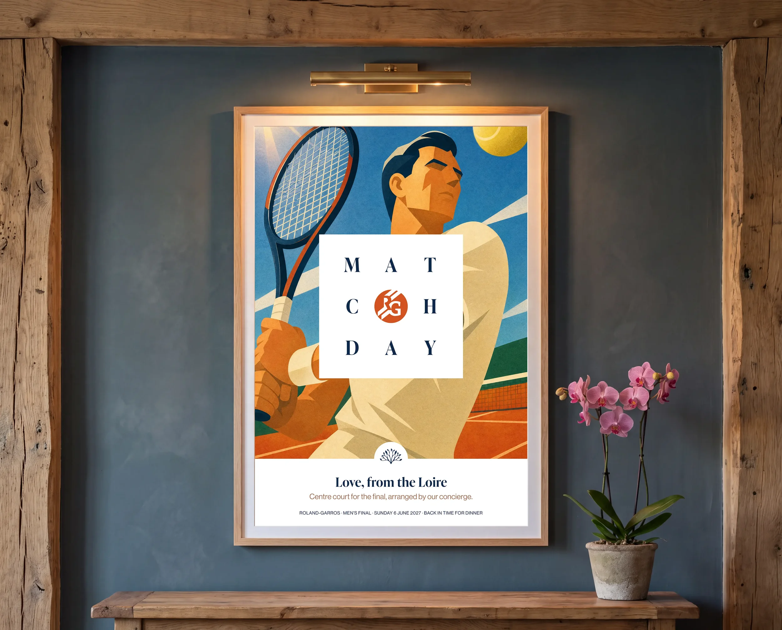
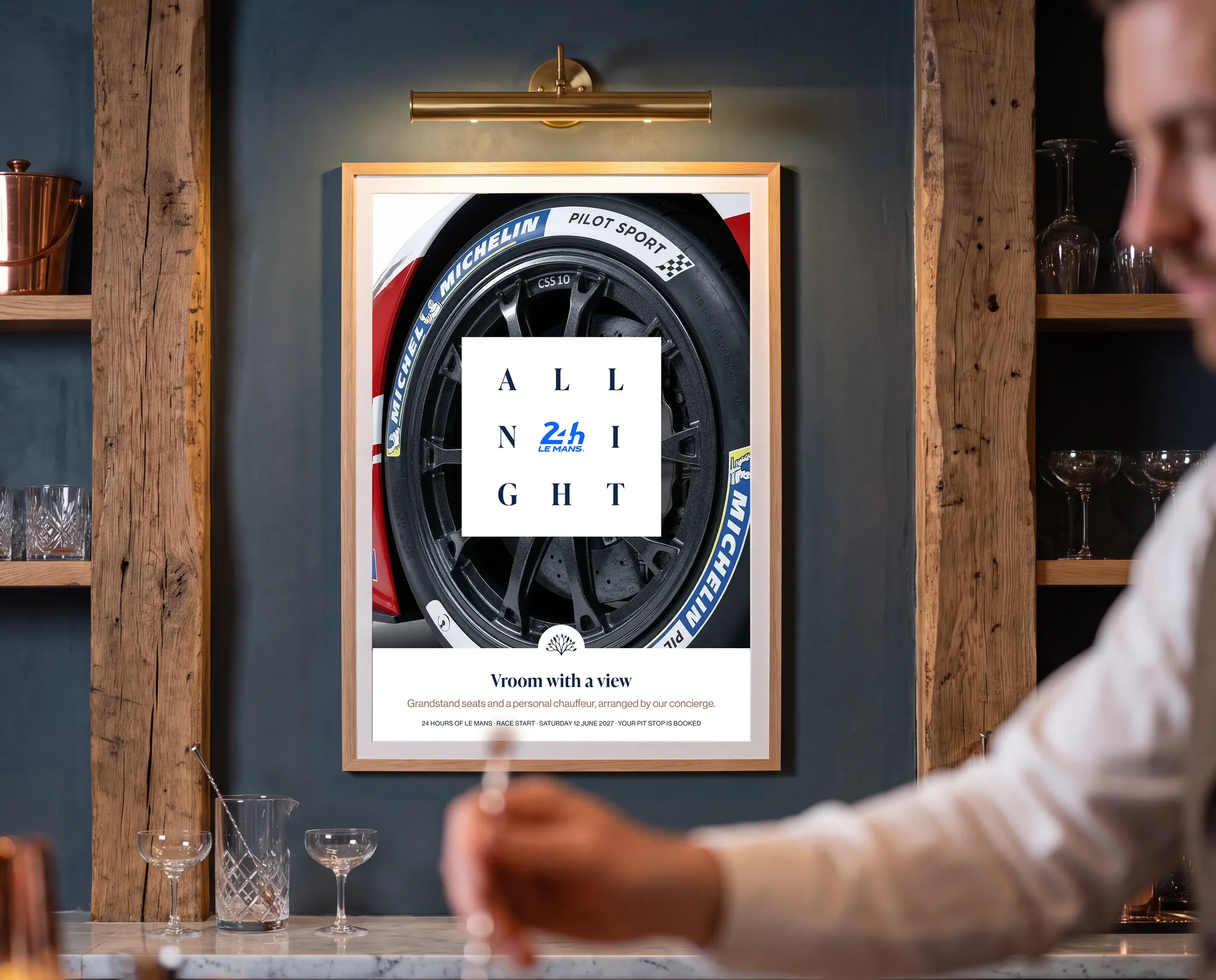
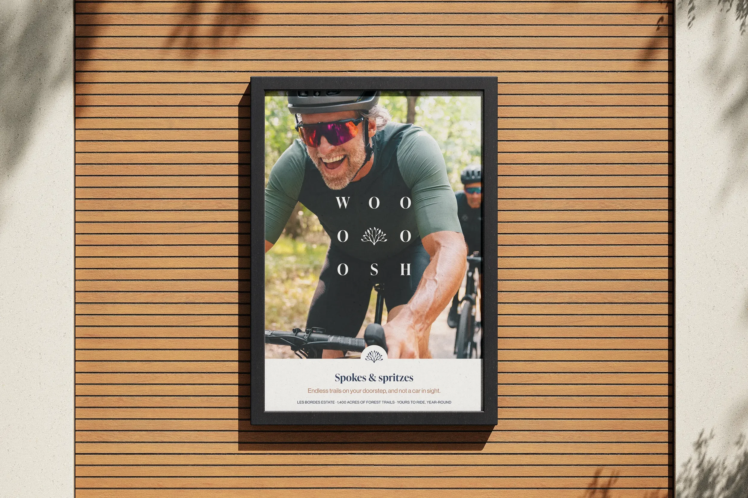
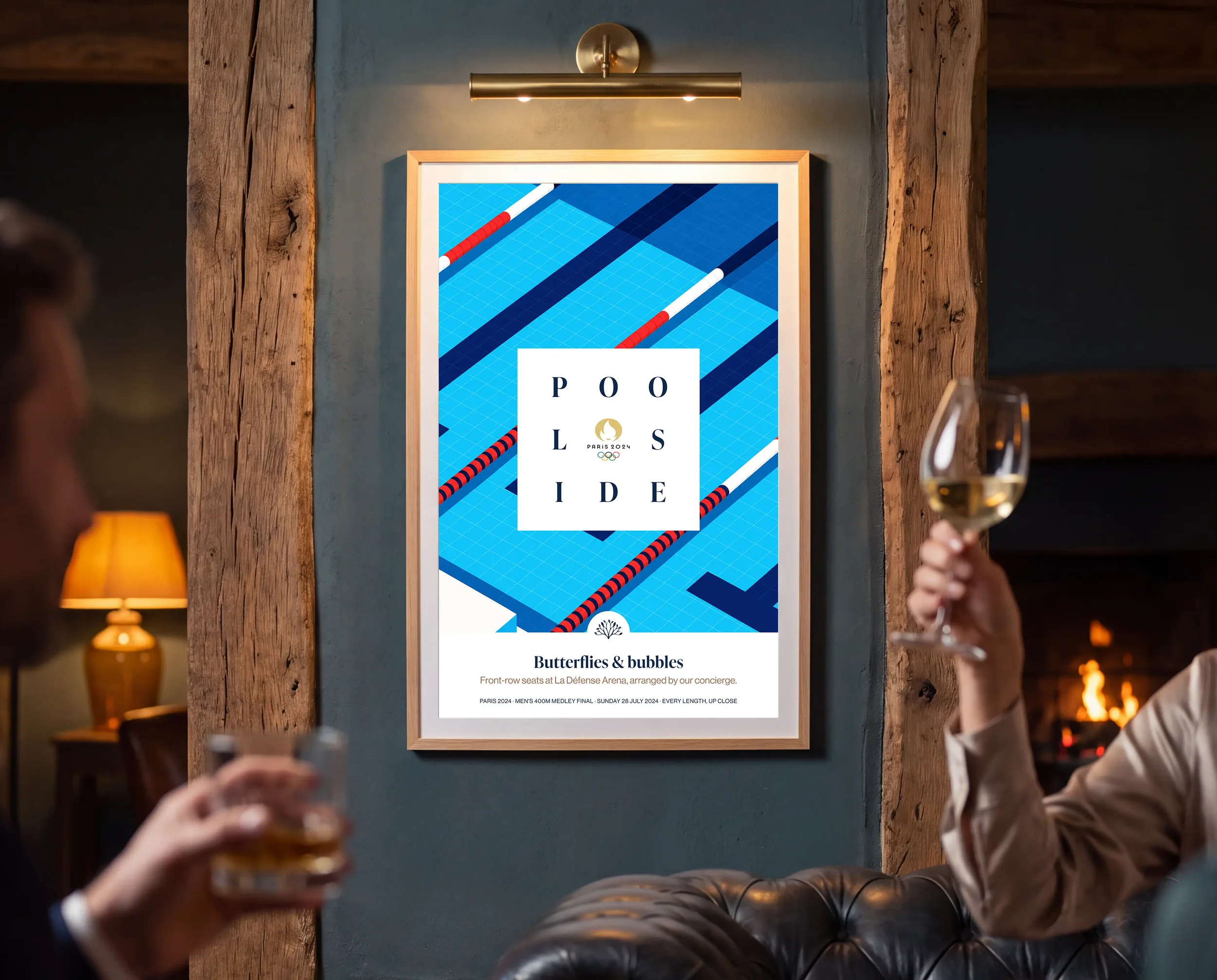
From there, we developed ways for the identity to do more. A more playful approach to the Les Bordes name gave us room for event messages, seasonal greetings and marketing stories, all recognisably part of the same family.
Finding the right voice
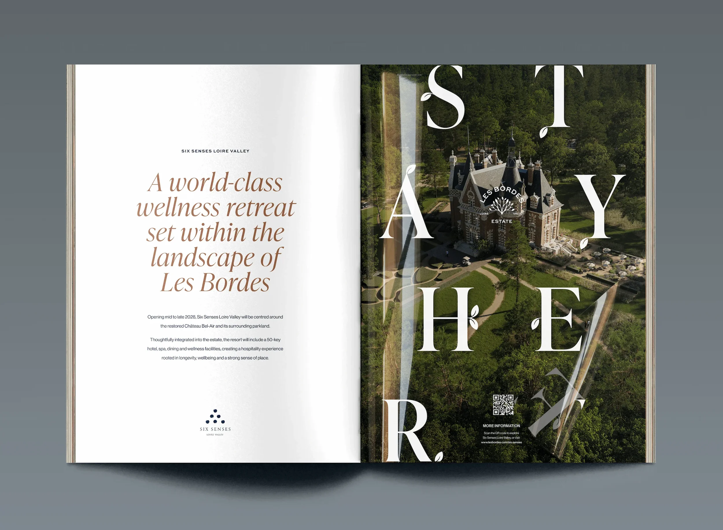
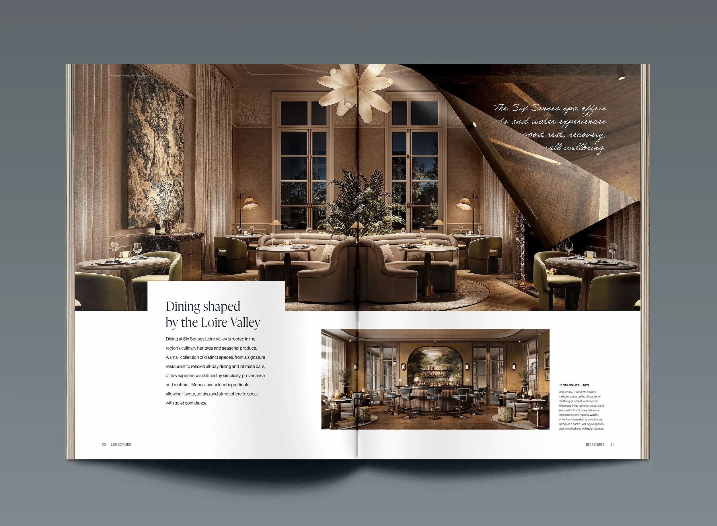
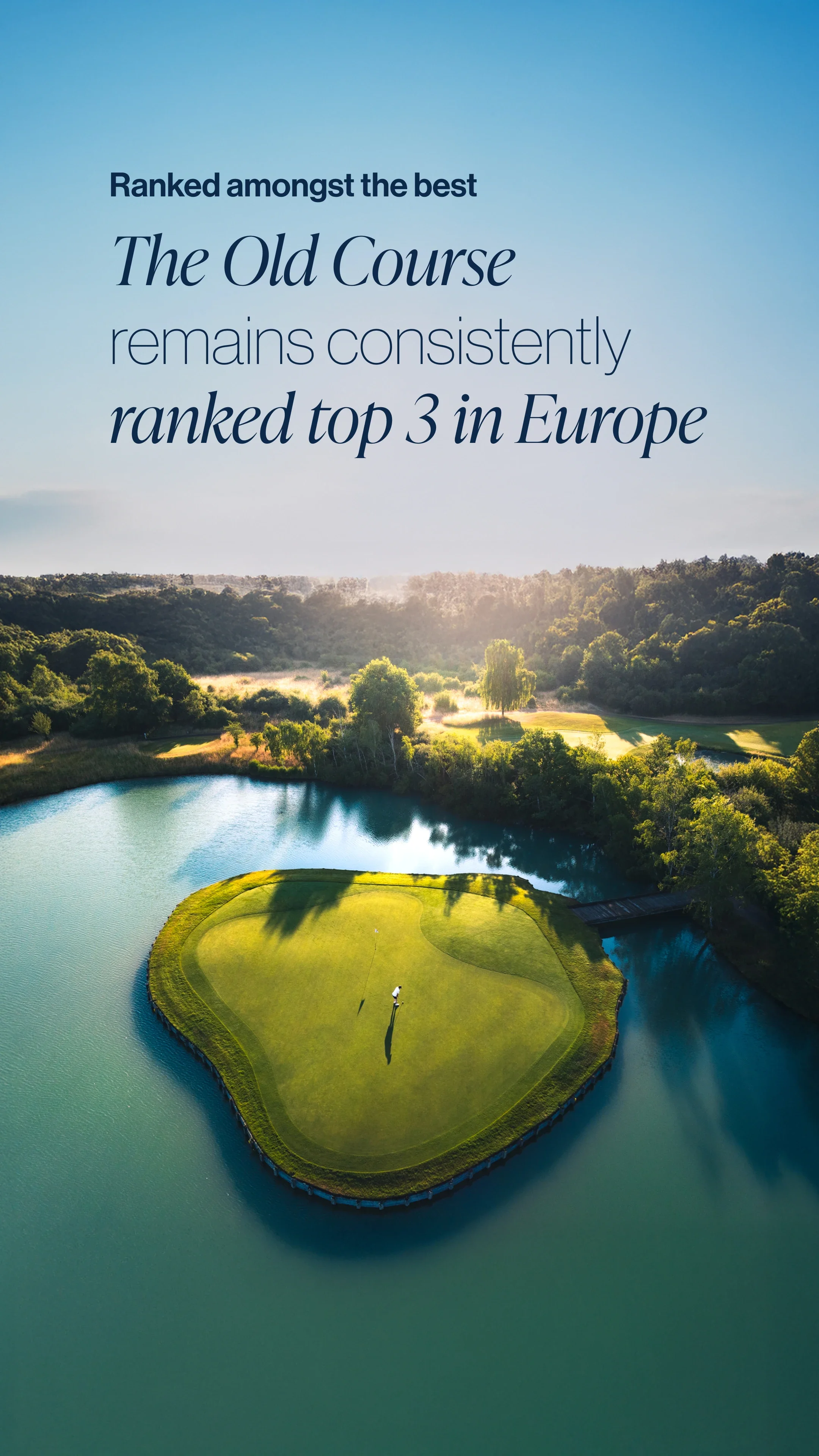
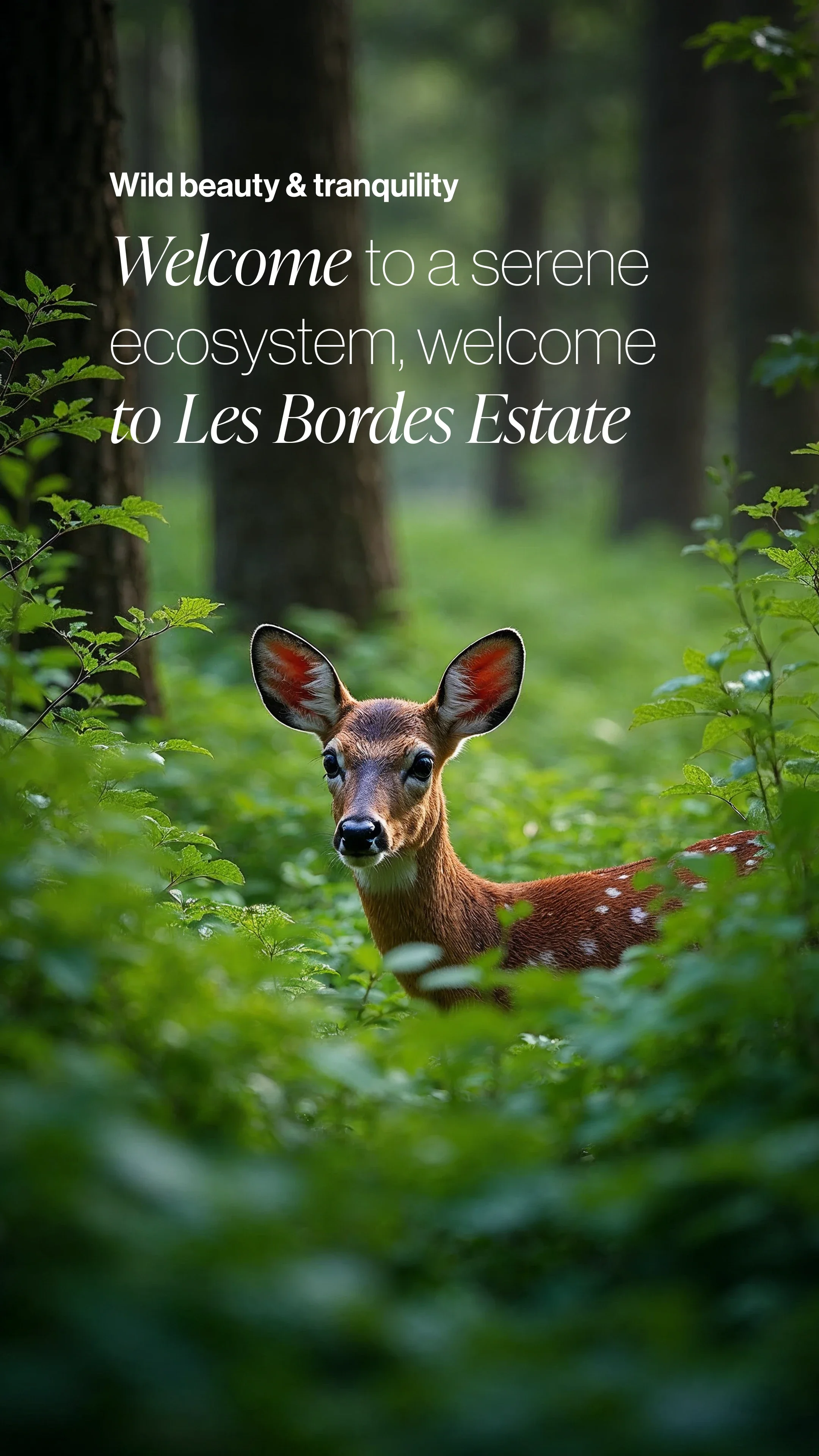
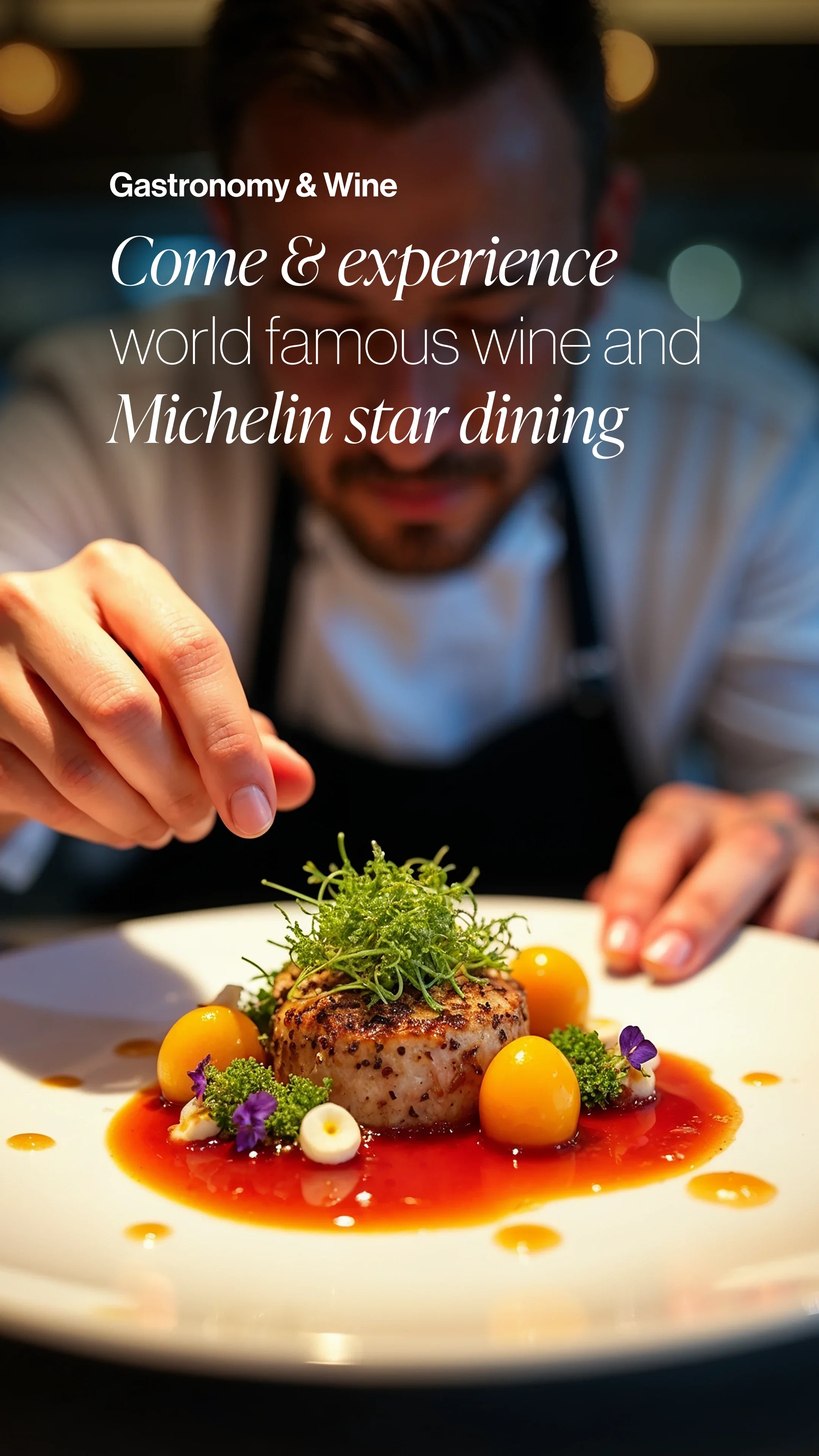
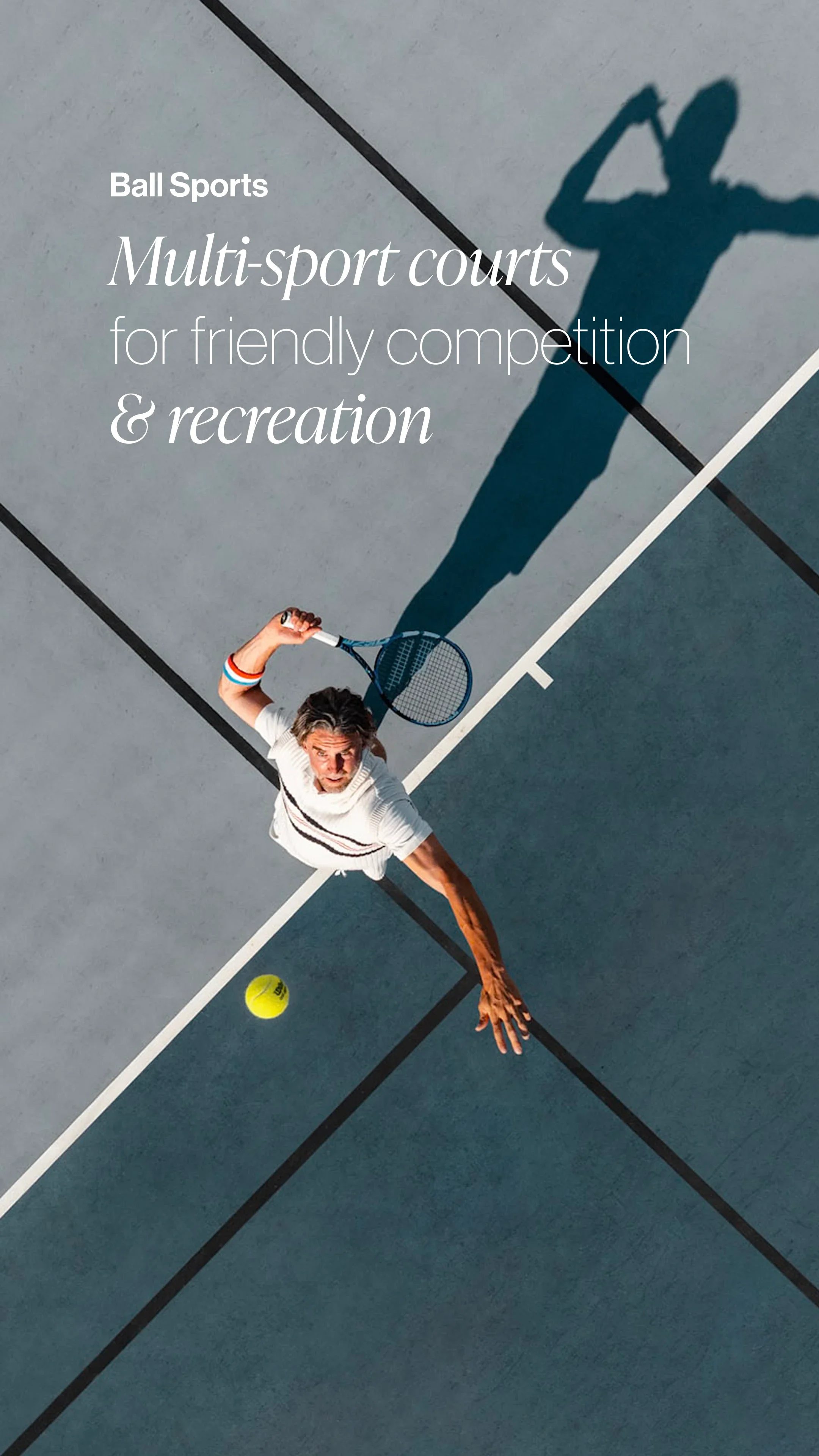
Typography brought the biggest change in character. We paired Ivy Presto Display with Neue Haas Grotesk, giving the identity a combination of warmth and precision that felt right for the estate.
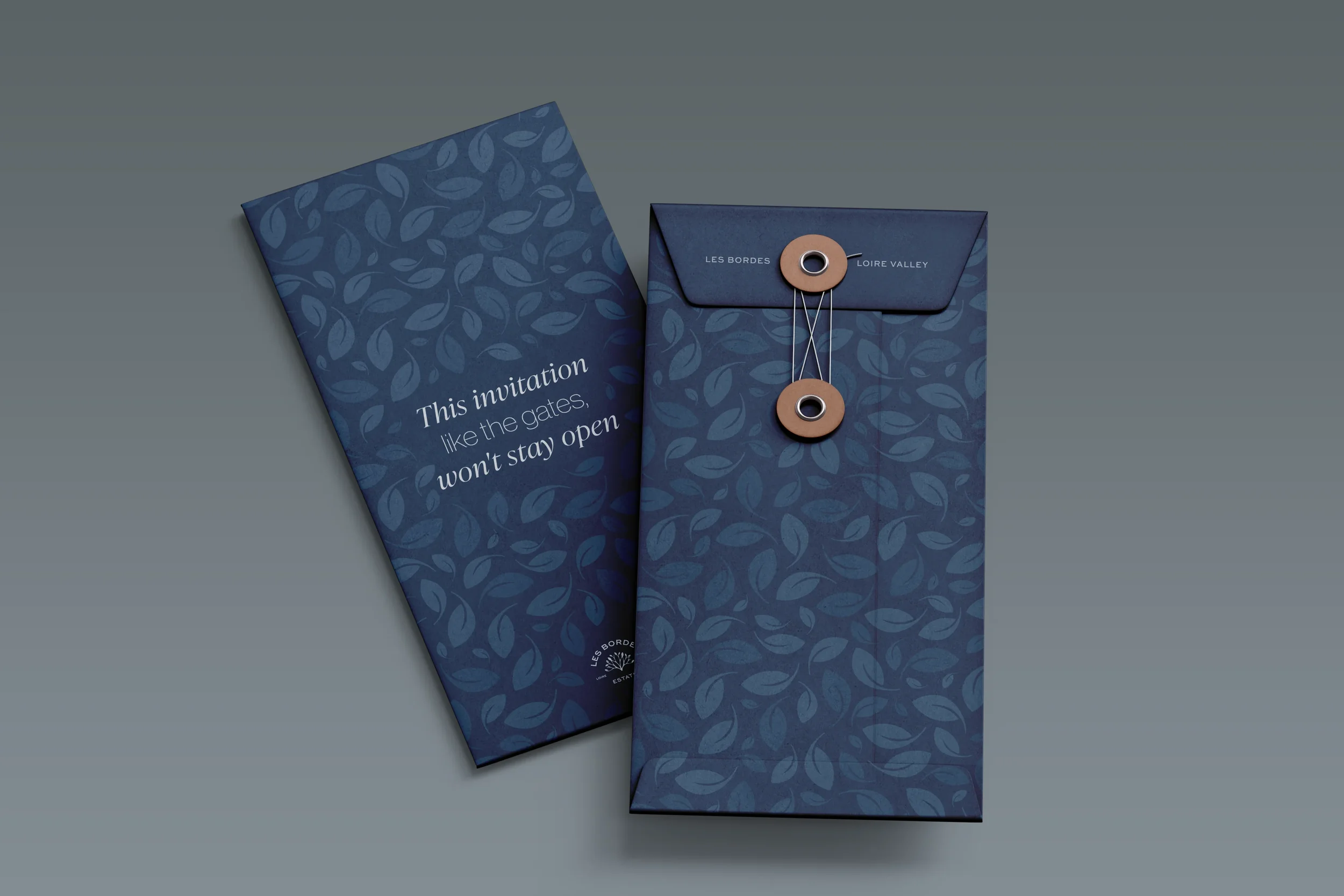
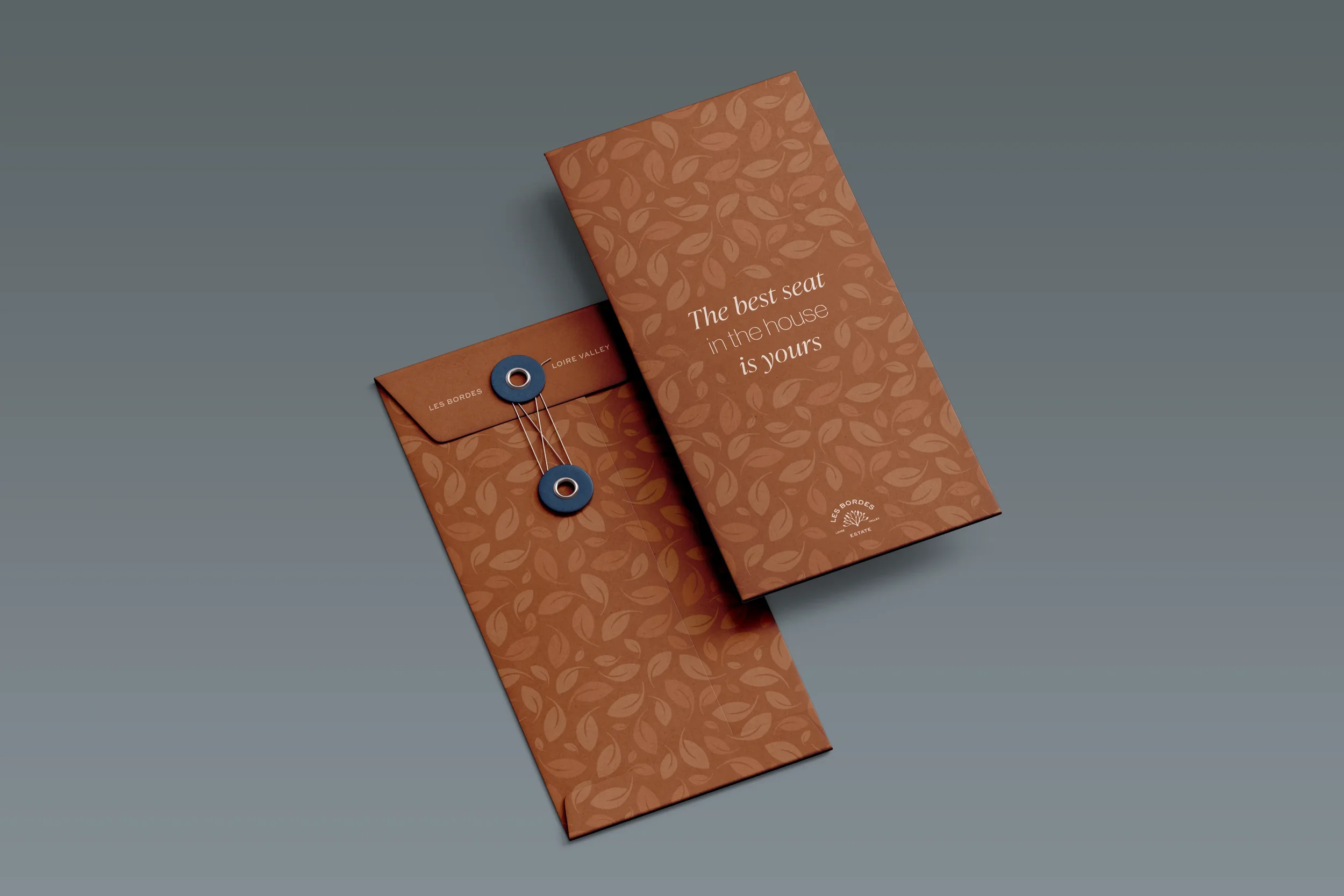
The pairing also gave us something to play with. A headline could read as one complete thought, while the words set in each typeface could carry a message of their own. It introduced a little wit and a reason to look twice, without asking the reader to work too hard.
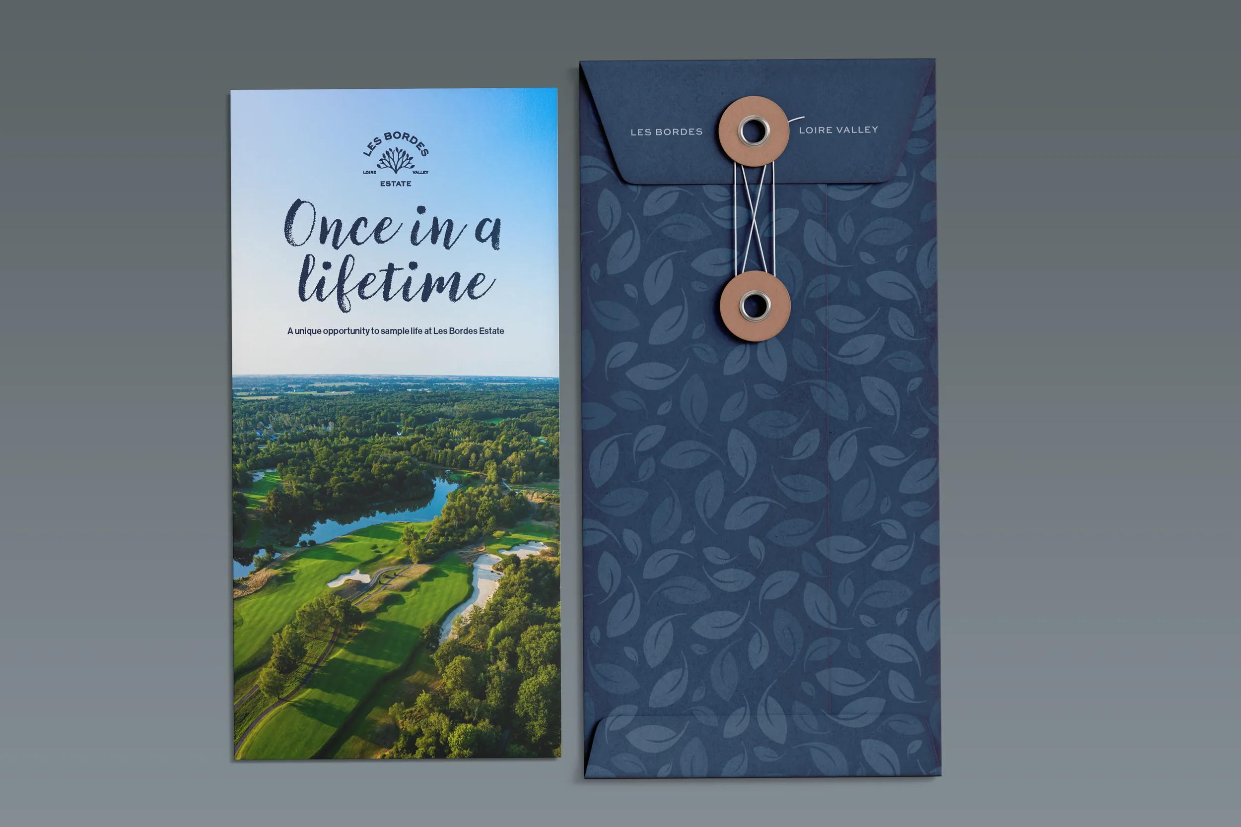
Finally, we took the leaves from the logo and developed an illustrated floral repeat pattern. Used here and there, it brought texture and personality to the materials, with a clear connection to the original mark.
The result felt like Les Bordes had caught up with itself: more consistent, more expressive and ready for everything taking shape beyond the golf course.