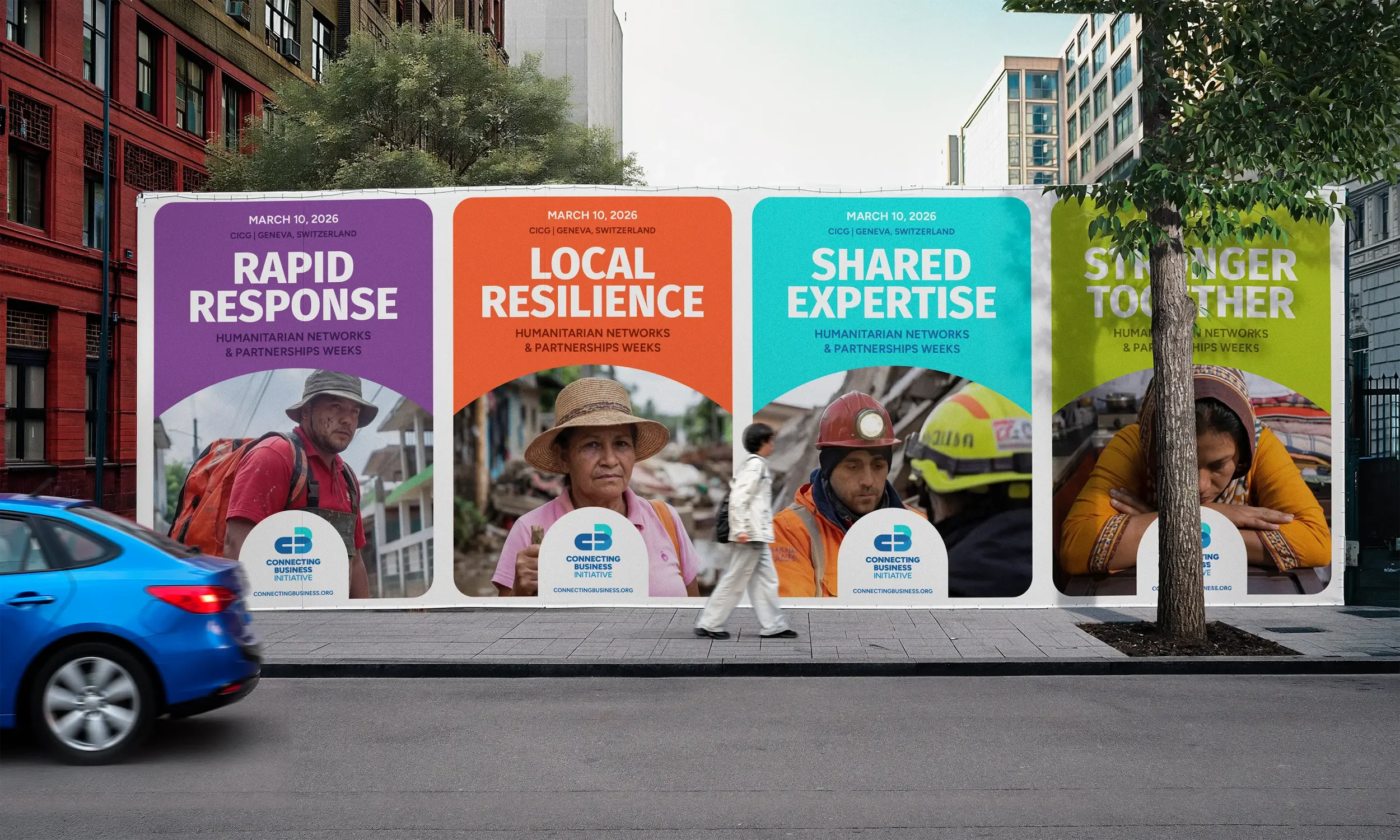
Built around connection before, during & after crisis
Client
CBI
DATE
April: 2026
The Connecting Business Initiative, better known throughout its network of partners and collaborators as CBI, brings together businesses, governments and humanitarian organisations before, during and after disasters. Rather than responding directly to crises themselves, they build the relationships and partnerships that make those responses possible.
Although CBI is part of the United Nations through OCHA and UNDP, it has always worked a little differently. The organisation exists to connect businesses, not simply represent another UN programme. That was the story the new identity needed to tell.

The power of connection
After almost ten years, the existing identity had simply run its course. Built around the visual language of the Sustainable Development Goals, it no longer reflected where CBI was heading. Businesses were the audience they found hardest to engage. They didn't want to look like another UN programme. They wanted an identity that felt independent, confident and collaborative.
It quickly became clear that the logo wasn't the real challenge. Understanding what made CBI different was. Once we understood that, the answer was simple. It isn't defined by disasters, but by the relationships it builds before a crisis happens, the coordination it brings during crisis, and the resilience it helps strengthen afterwards.
Knowing what the brand needed to say was one thing. Finding the right way to say it took a little longer. Some ideas explored bold geometric forms inspired by on and off switches. Others imagined flowing connected networks. Gradually though, those ideas became simpler, evolving into monograms and symbols built around connection, movement, resilience and dissemination.















A single letter C
Like every identity project, there were dozens of ideas. Some disappeared quickly, others evolved into entirely new directions. But the more we explored, the more the monogram simply made sense. The simpler it became, the more everything seemed to click.
A single letter C became the building block for the entire mark. Reflected and repeated, it creates the C & B while quietly forming the first link in a chain, expressing how CBI connects businesses, partners and humanitarian organisations into stronger networks. The transparent overlap reinforces ideas of coordination, resilience and collaboration across every stage of an emergency. It also raised one obvious question. If the organisation is called CBI, where's the i?
As the project evolved, the answer became obvious. The symbol was never there to spell out CBI. It was there to capture what sits at the heart of the organisation. Connecting businesses. That's where the real energy was, so that's where the identity found its focus.
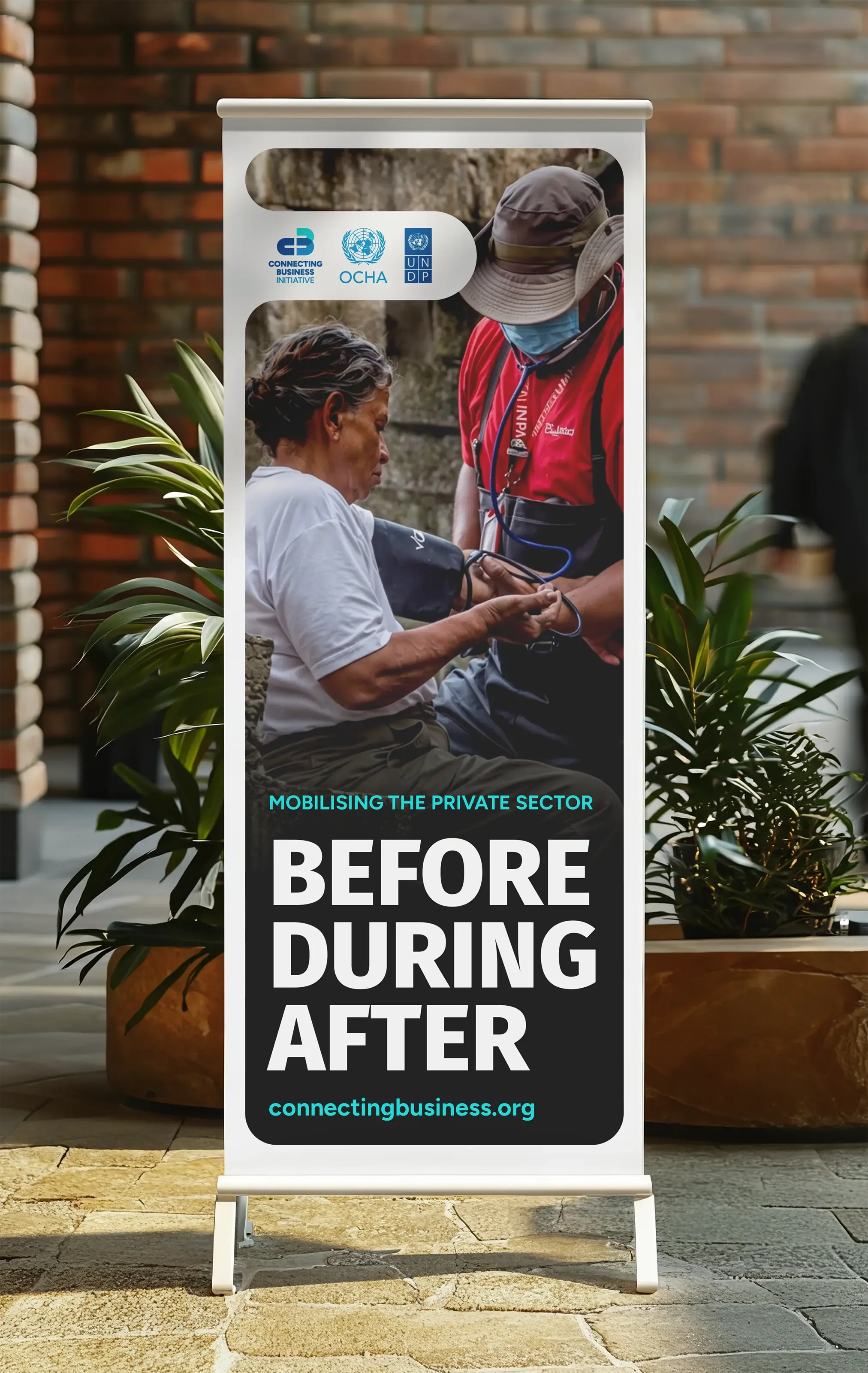
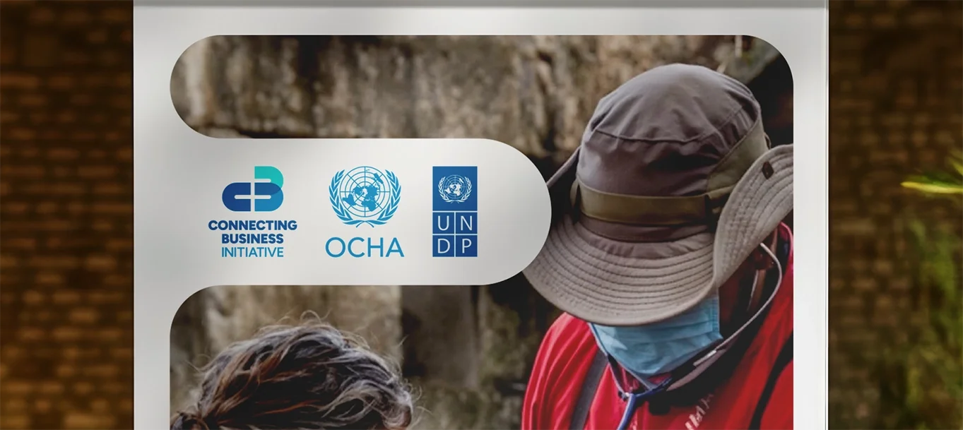
Colour followed a similar journey. The original ambition was to leave UN blue behind altogether, but the further we explored, the clearer it became that there was value in keeping that visual connection. Rather than abandoning it, we refined it. The two blues from OCHA and UNDP remained, complemented by a carefully chosen turquoise that gave CBI a distinctive colour of its own while allowing the three identities to sit comfortably alongside one another.
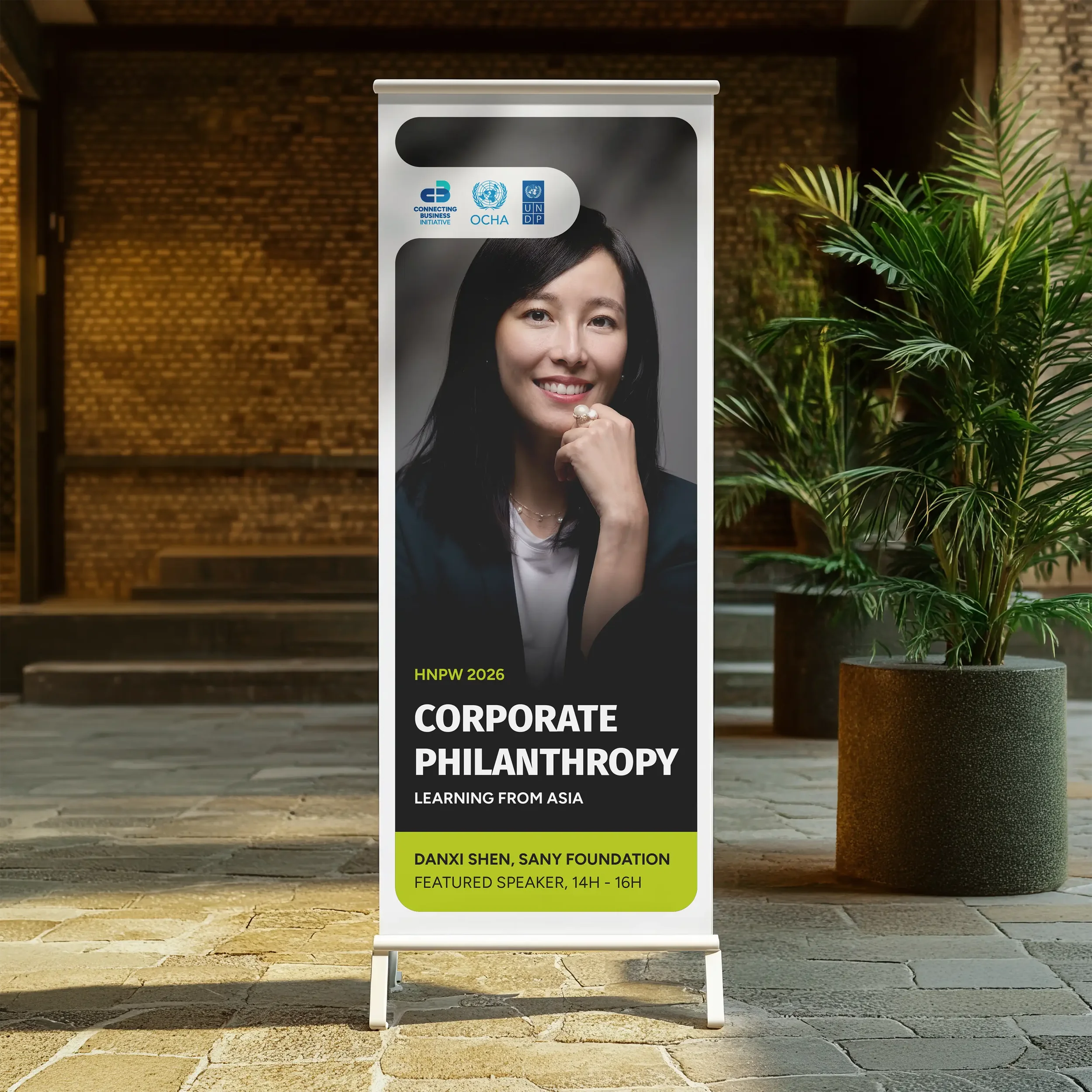
As the brand evolved, the curve of the C naturally grew into the wider design language. It created the distinctive white spaces that frame photography and content throughout the brand, giving everything from conference banners and pull-up displays to reports and presentations a recognisable thread that quietly ties the whole identity together. Together with the colour palette, it gave the identity a consistent visual language that could flex across every touchpoint while always feeling unmistakably CBI.
In the end, it became a simple expression of what sets CBI apart, strengthening partnerships long before a disaster strikes and long after the immediate response has passed. The same thinking runs through every part of the identity, from the logo itself to the photography, graphics and colour system, creating a brand that feels connected wherever it appears.